Overview( 01 )
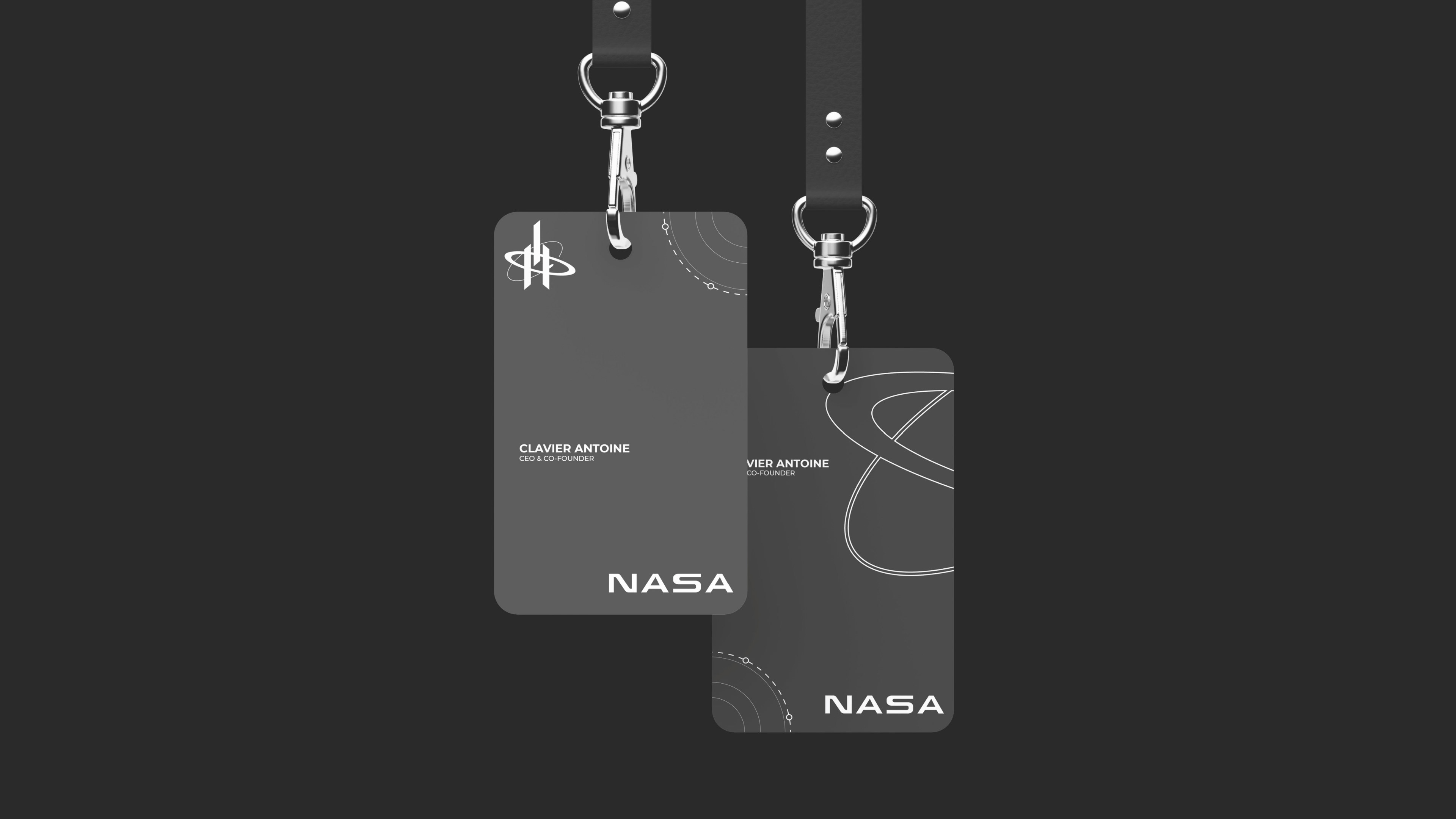
NASA is a rebranding concept for a public space institution, built around mission language, image authority and durable typographic hierarchy. The study looks at how a scientific organization can keep its iconic presence while gaining a sharper system for campaigns, educational content, editorial layouts and digital communication.
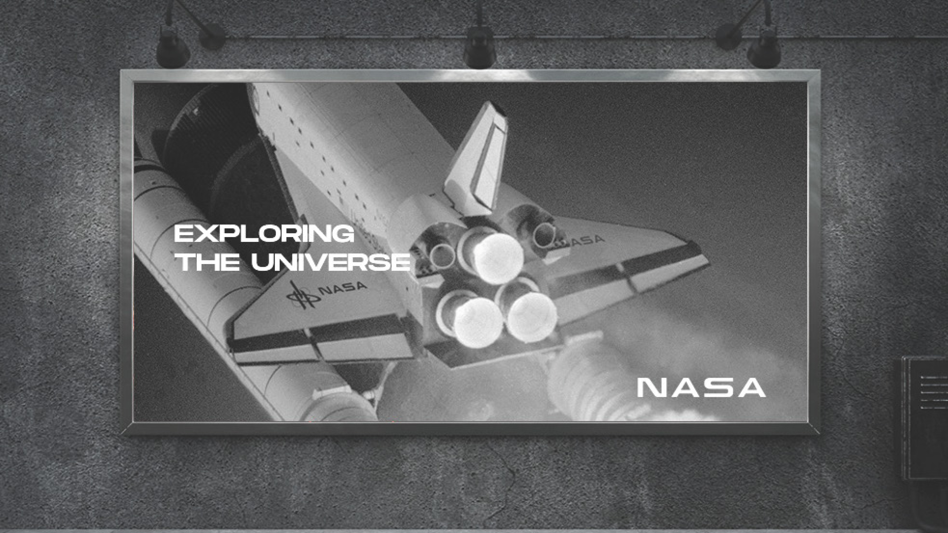
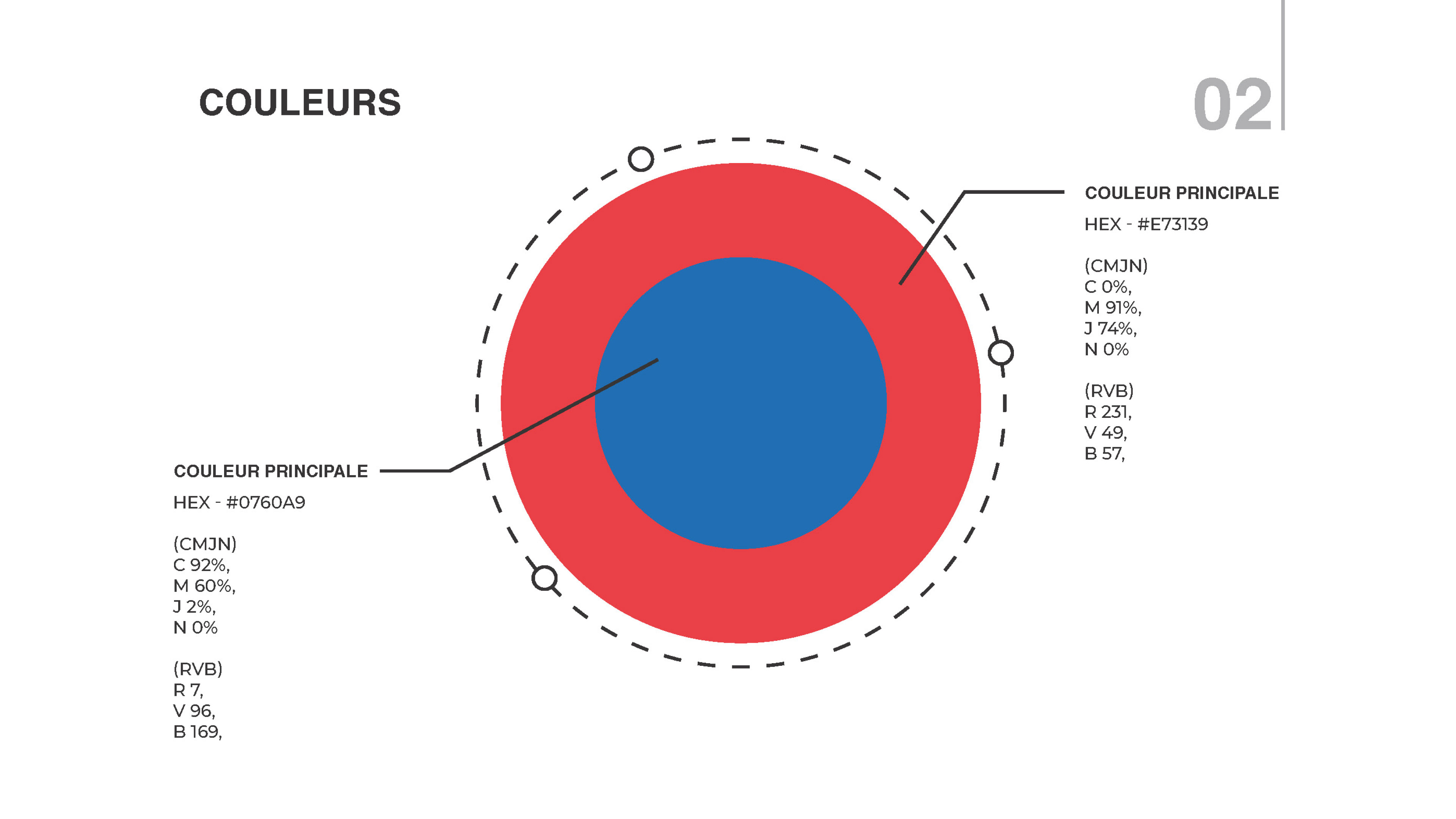
The direction uses bold contrast, modular grids and archival-inspired image behavior to create a visual identity that feels institutional, cinematic and usable. The goal is not to replace the history of the mark, but to test a coherent contemporary system around it.
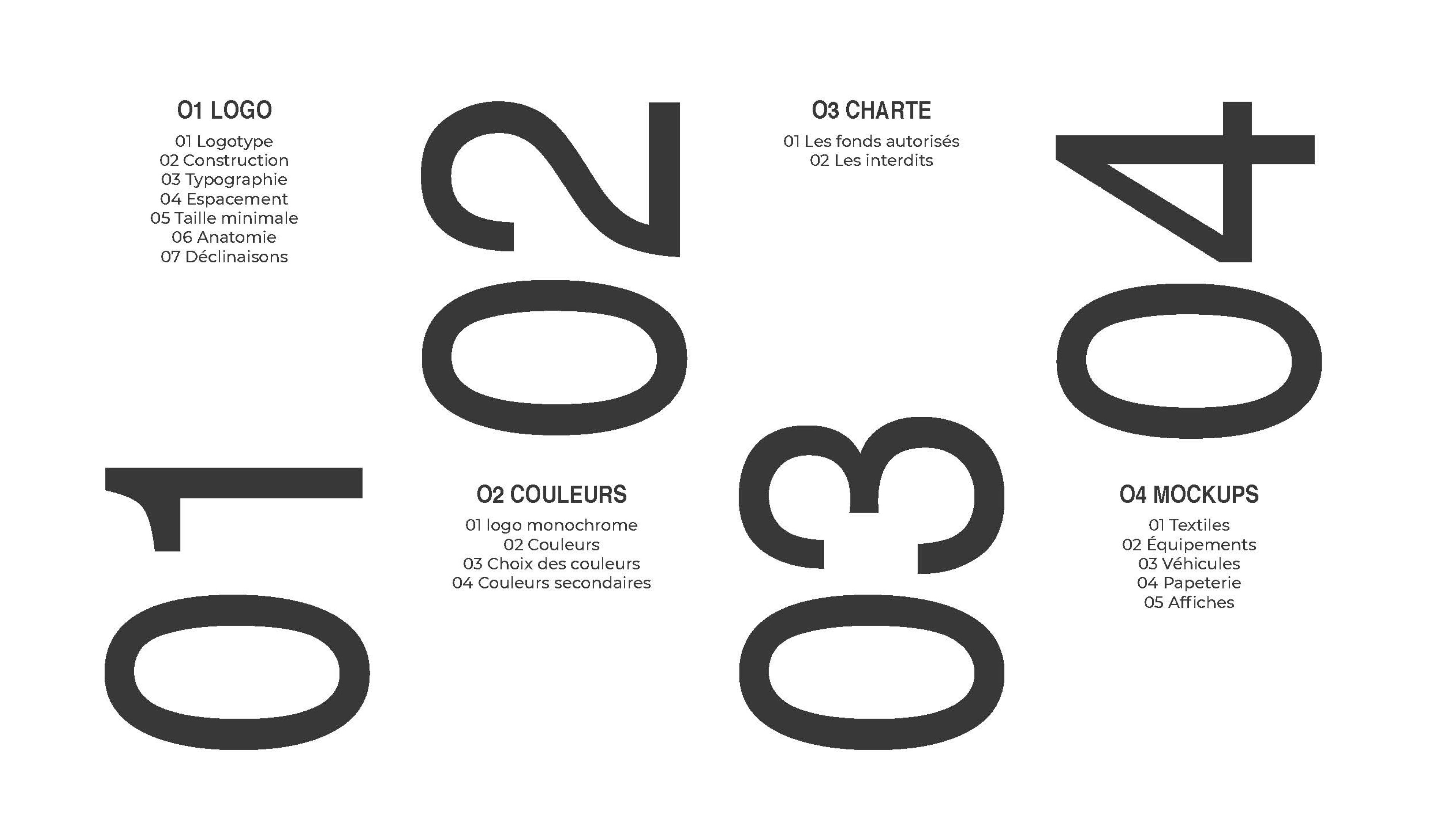
Scope: rebranding concept, art direction, typography, image system, campaign assets and digital guidelines.