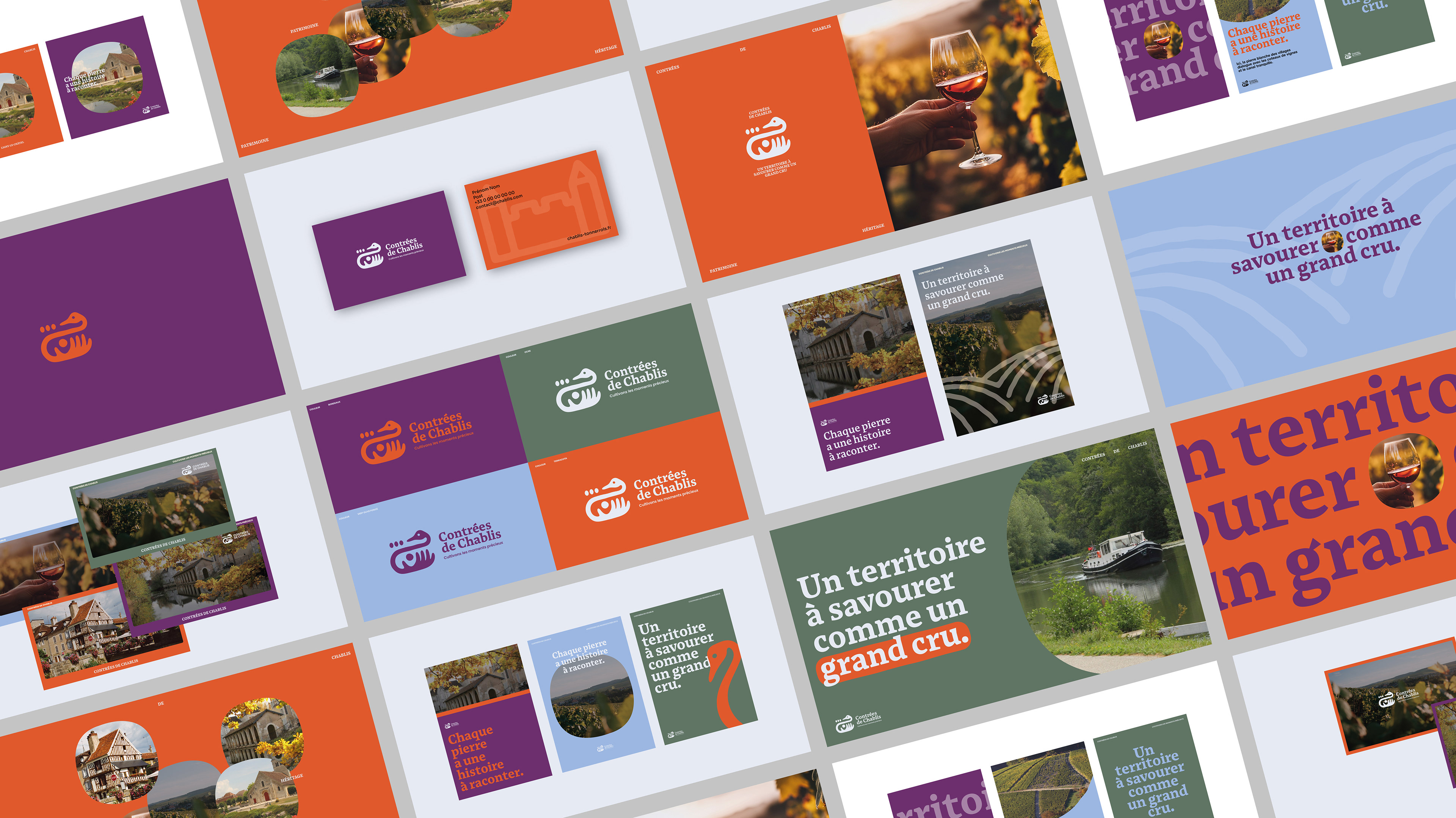
Overview( 01 )
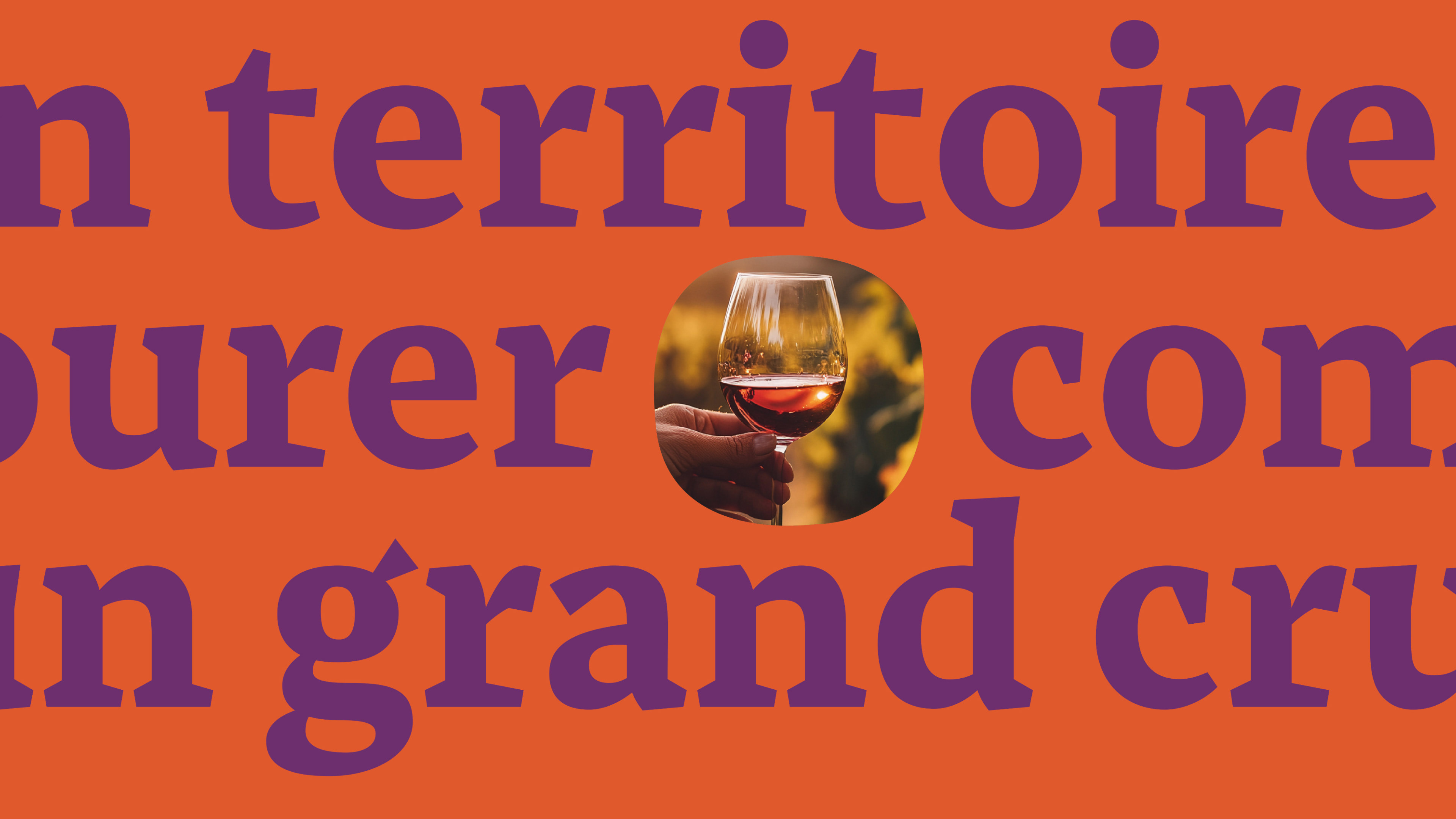
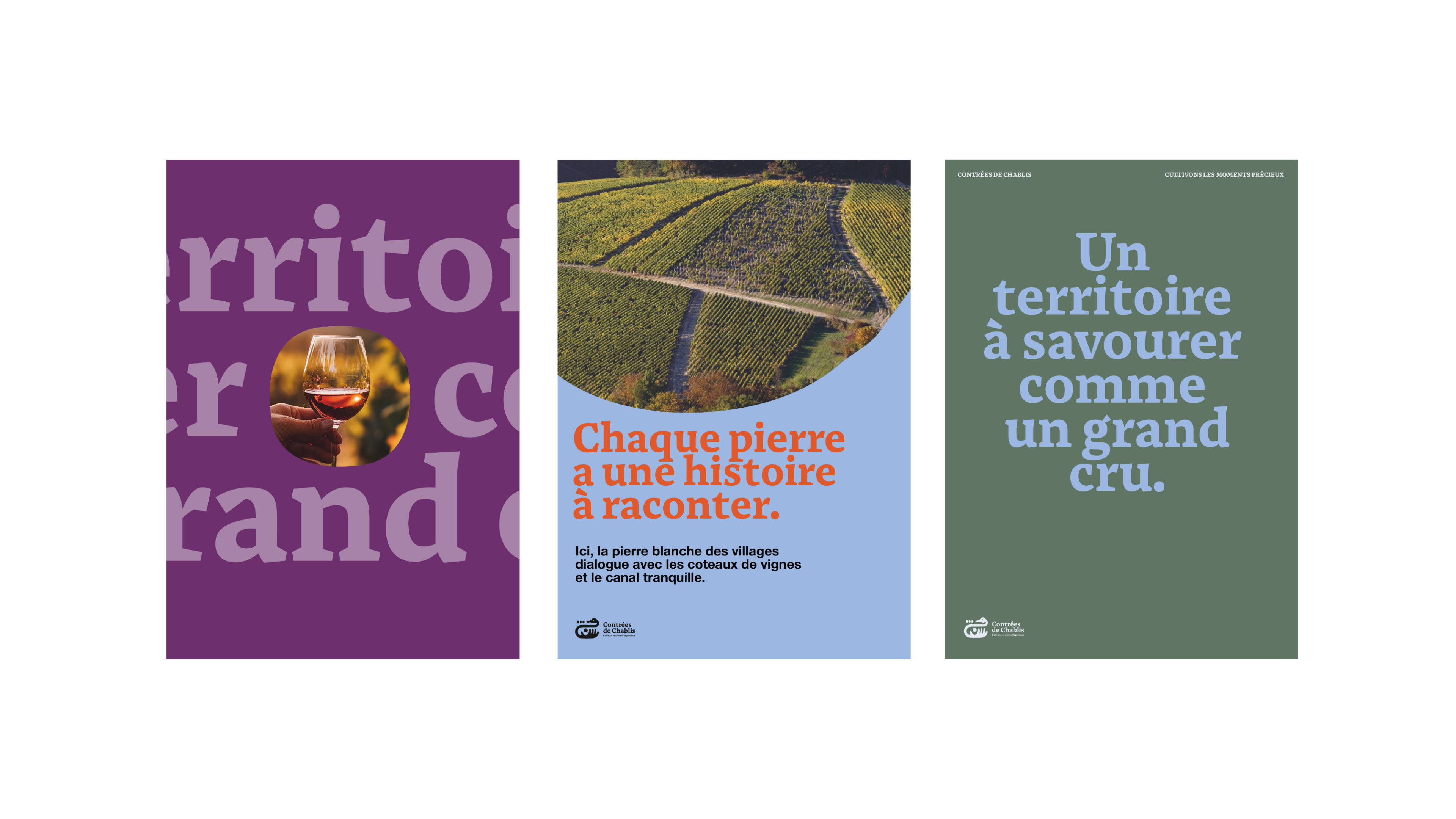
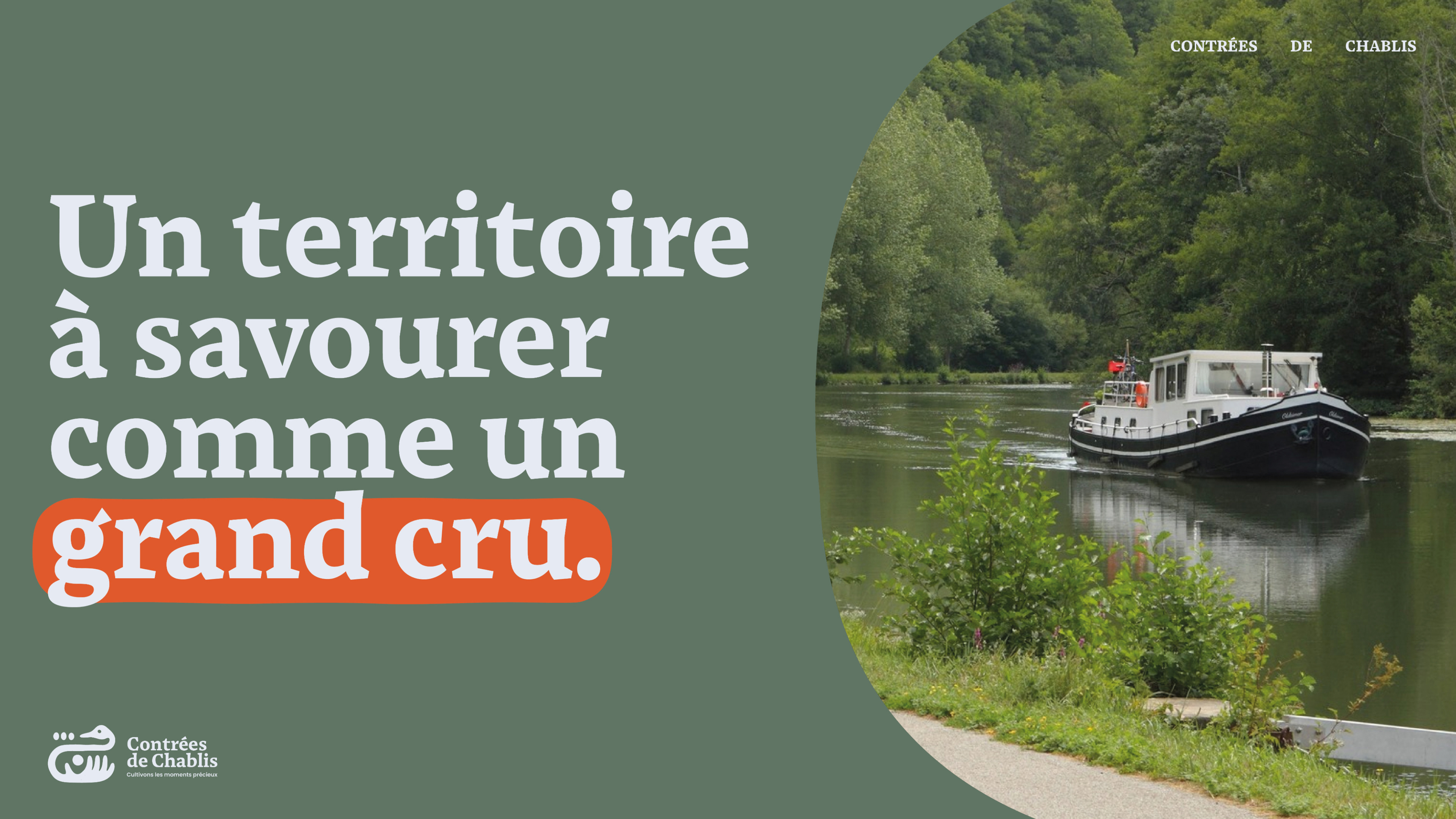
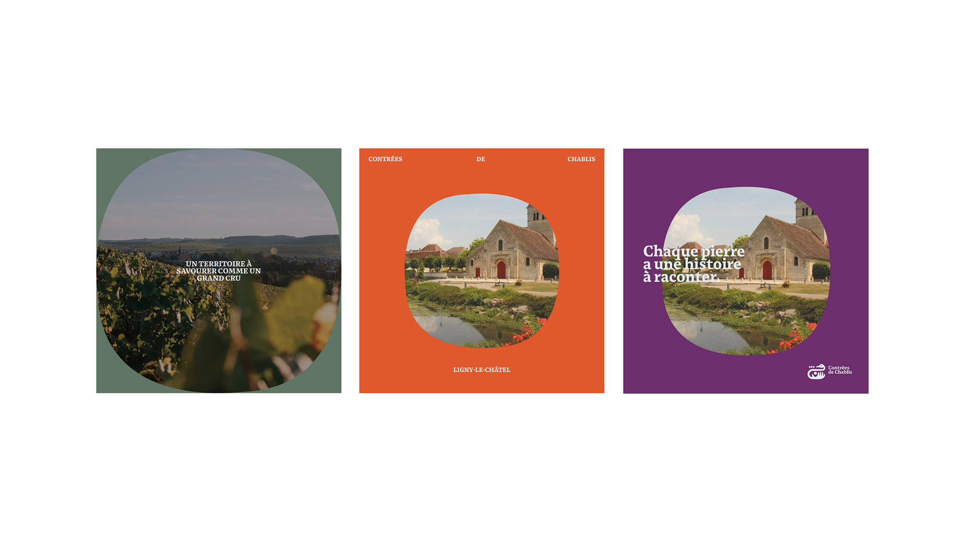
Contrée de Chablis is a visual identity project for a wine-led cultural territory, shaped around editorial restraint, regional texture and a contemporary graphic rhythm. The system balances quiet typography, confident image placement and tactile print cues so the brand can move across signage, packaging, campaign material and digital contexts without losing its sense of place.
The project explores how a regional wine identity can feel precise without becoming nostalgic. I focused on typographic hierarchy, image pacing, warm material cues and a flexible visual language for communication, events and printed matter.
Scope: visual identity, art direction, layout system, print applications and digital presentation.