Milele premium coloured contact lens identity and packaging project by Kalypt Studio

Overview( 01 )

Milele is a premium coloured contact lens brand designed for the Southeast Asian market. Its identity seeks to balance beauty, comfort and confidence through a contemporary universe inspired by the codes of high-end skincare.

The project combines visual identity and packaging design to position contact lenses as a true beauty product.

Scope: visual identity, art direction, packaging design, beauty brand universe, lens pattern system and premium skincare-inspired communication.

Milele is a premium coloured contact lens brand identity and packaging project by Kalypt Studio for the Southeast Asian beauty market. The project combines visual identity, packaging design, contemporary skincare-inspired codes, soft colour systems, eye pattern graphics and premium product communication. It positions coloured contact lenses as a beauty object built around comfort, confidence and refined visual language.
Milele premium coloured contact lens logo and identity system
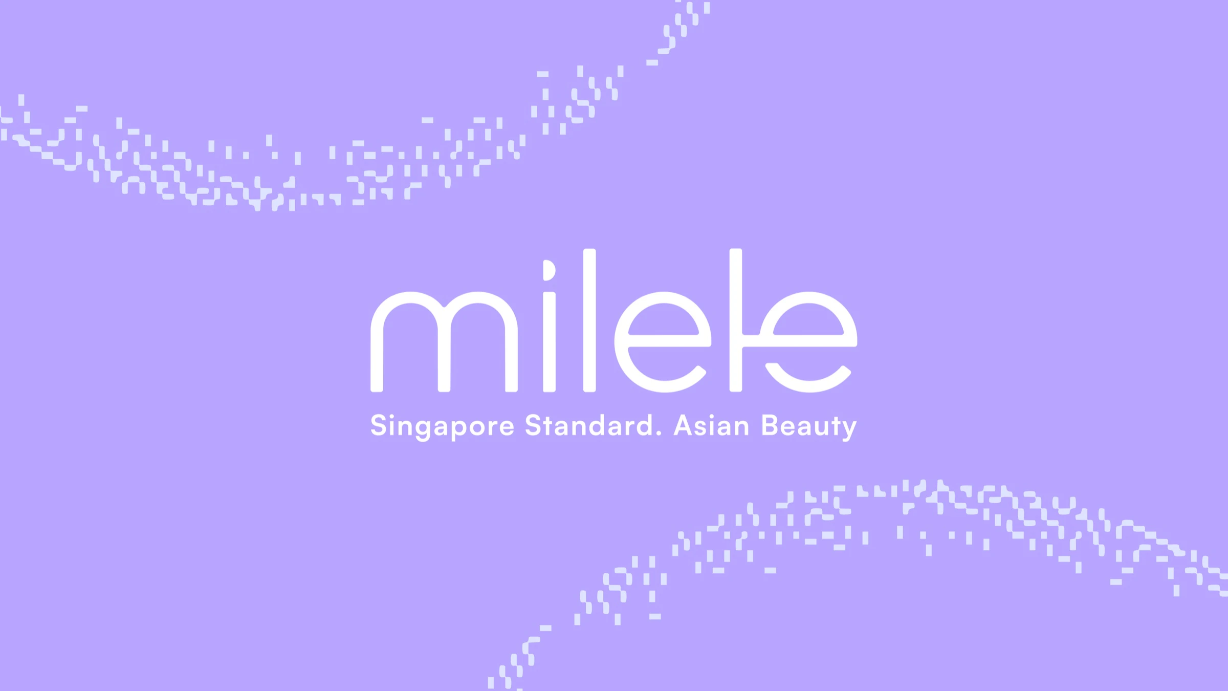
Milele Singapore Standard Asian Beauty brand lockup on soft lavender gradient
Milele contact lens pixel eye pattern and dark blue brand background
Milele contact lens brand system with white logo and pixel eye patterns
Milele contact lens symbol and digital eye motif exploration
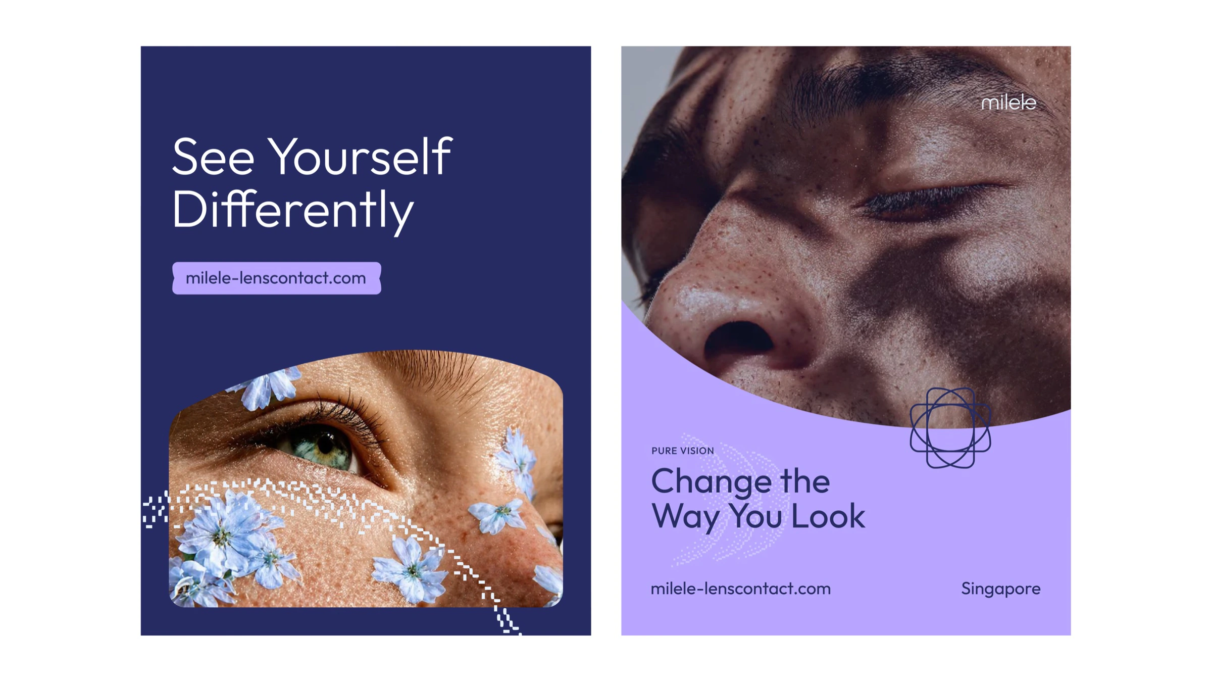
Milele coloured contact lens campaign posters and skincare-inspired art direction
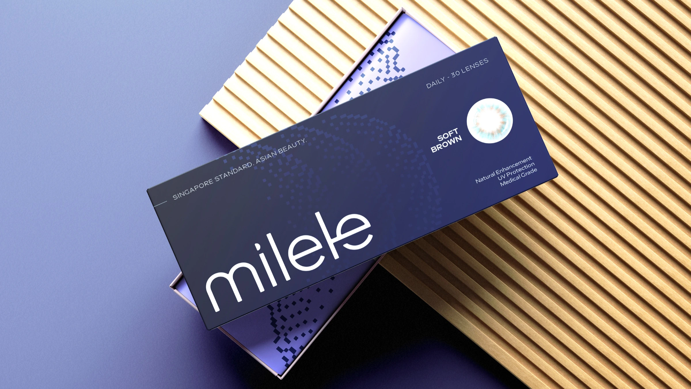
Milele premium coloured contact lens packaging mockup
Second visual route Version two
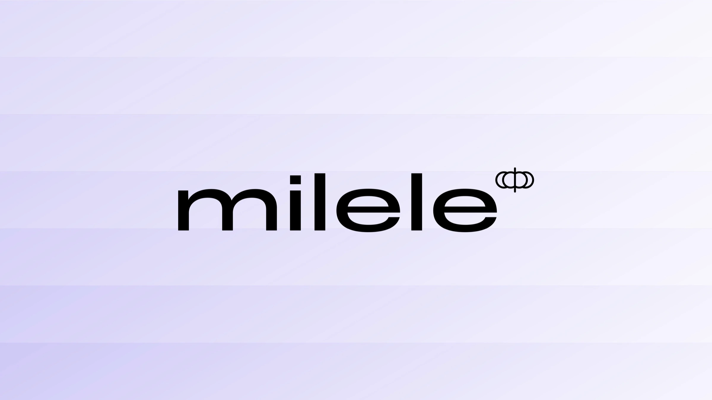
Milele refined logotype on pale lavender horizontal bands
Milele black identity system with oversized lens construction lines
Milele icon mark on soft lavender background
Milele black logotype and icon lockup on white background
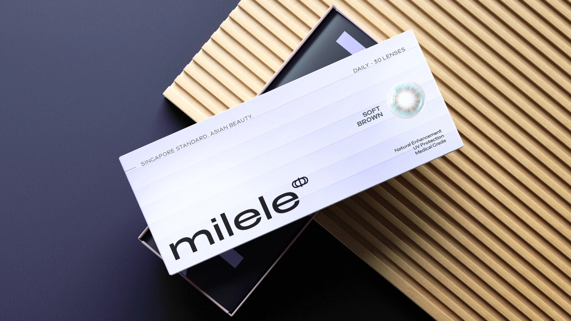
Milele refined soft brown contact lens packaging mockup
Milele alternate icon construction and refined line mark
More projects( 02 )

More selected work